

DUNDAS STREET LAW OFFICE 2019
This fit-out, located on the top floor of a building in central Wellington, replaces one from a previous tenant. In the previous configuration entry was from the East side of the lift lobby and individual offices and meeting rooms were located around the perimeter with convoluted internal circulation. Part of the skylight was obscured and the remainder of it only illuminated a portion of the hallway.
Dundas Street Law Office is a well-regarded small to medium sized legal practice that specialises in employment law. They are a characterful and unique practice and the fit-out was designed to reflect this, whilst seeking to provide a comfortable and relaxing environment for their clients. The floor of the building was purchased with the intent of creating a long-term home.
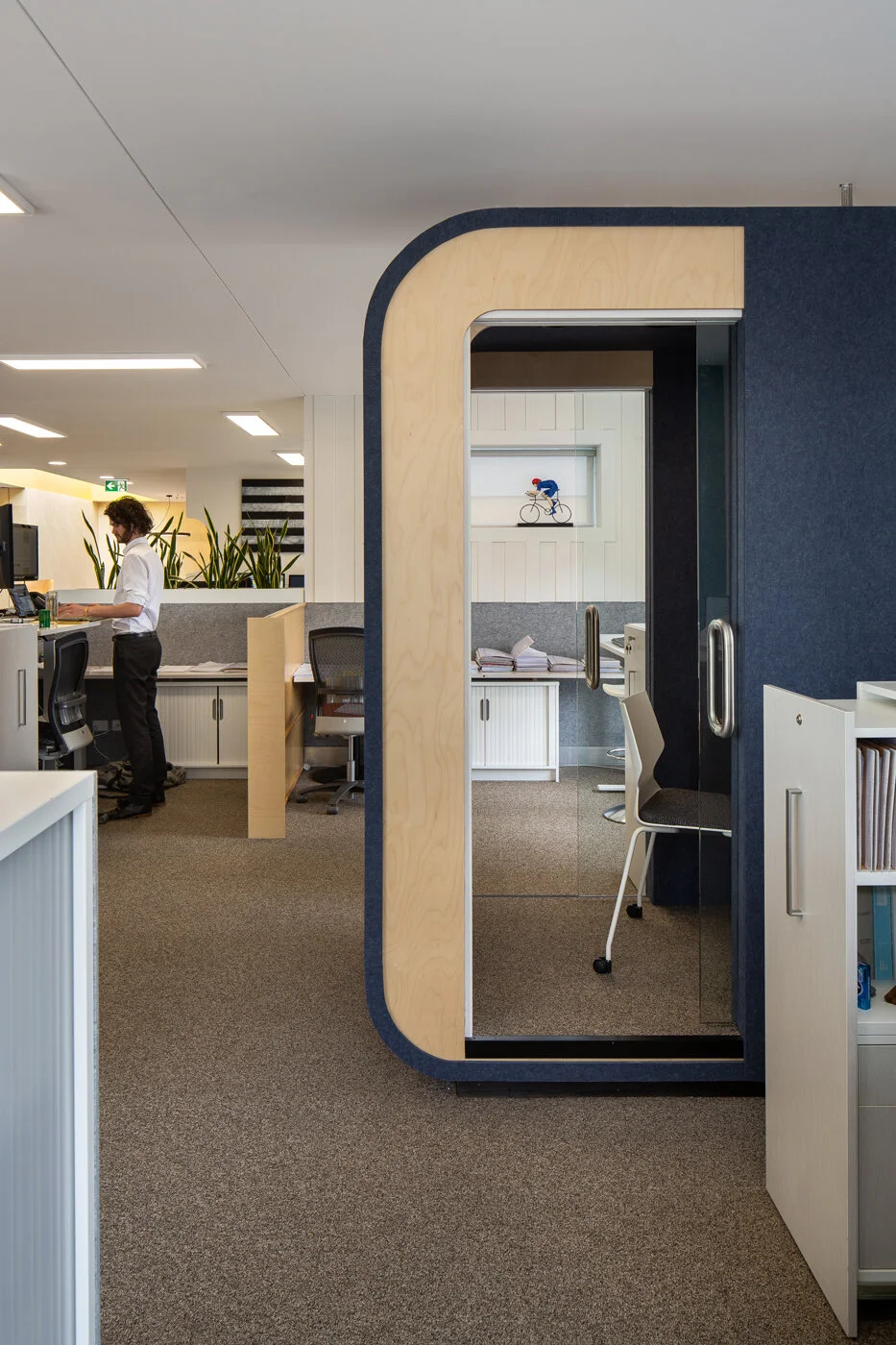
Removing a section of concrete wall in front of the lifts has allowed entry towards the North and beneath the existing skylight (now painted yellow to celebrate the light) and leads into a new open reception area and views out through the spaces to the city. They had a need for a variety of different and flexible spaces, from a large open plan working area to a separate more casual area for staff and visitors and a variety of meeting rooms and booths for private meetings and telephone conversations.
Shapes were drawn from the Dundas Street logo and a series of porthole windows in the original building’s rooftop (which are still visible through the existing skylight) and led to the introduction of casual, playful elements which are used to help orchestrate the entry and reception spaces and joinery design.
The existing fit-out glass partitions were salvaged and reused within the folded glass and timber meeting room screen and all of the doors and aluminium frames are also re-used from the previous fit-out. All partitions were timber framed, along with extensive use of timber elements throughout the fit-out and on the two rooftop terraces. Almost all of the existing office furniture from the clients previous fit-out was incorporated into the design with existing desks and storage units wrapped in plywood and acoustic panelling to integrate them with the new layout, with new furniture specified for the more public spaces. The existing carpet tiles were reused by a local school and all lighting was upgraded to LED.
Photography - Paul McCredie
